Writing Object-Oriented and Scalable CSS FOR DNN
Heather Buchel / Front-End Developer
@hbuchel
How can we leverage DNN and OOCSS to create future friendly, scalable websites?
How We Use DNN at Gravity Works
DNN is a foundation.
We use 3rd party modules to handle the CMS side of things and custom modules to handle custom features and web "app" components.
The Front-End Tools We Use:

OOCSS

SMACSS

Gulp + Sass + Compass
What This Gives Us:
Better Maintainability
Build tools can help streamline development, making it easier to maintain projects.
Easier to
Scale
Using OOCSS principles, our CSS will be easier to scale, modify, and grow.
Future
Friendly
Revisiting older projects will be less of a pain when it comes time for new additions.
Happier Front-End Devs!
Your front-end devs will delight in cleaner stylesheets and having less pain points!
Before we get to our CSS
A Brief History and Where We Are Now
The Old Way: 3rd Party Modules

Some DNN Modules...
- Are Opinionated Not Responsive
- Are Not Templatable Can't change the Markup
- Are Not Themable Can't change the CSS
- Use Non-semantic HTML Improper use of tables, badly markedup form elements
- Force you to use janky CSS Deep Selectors or !important
The same holds true for most content management systems.
The Old Way: Custom Modules
Custom modules can fall into the same pitfalls:
Scattered module.css files with unshareable styles
The New Way: 3rd Party Modules
Choose Better 3rd Party Modules
Are they templatable and themable?
Can you maintain your changes and documentation easily?
Do they work responsively? Are they using semantic HTML?
The New Way: 3rd Party Modules (cont)
Our Favorite Modules

News - Events - Content Types

News - Content Types

Everything ever!
The New Way: Custom Modules and 3rd Party Modules
Get Rid of Scattered Stylesheets in DNN
96% of our styles are defined in our skin.
Now that that's cleared up, let's talk about our CSS
Object Oriented CSS
Separate Structure
and Skin
and Skin
Separate Container
and Content
and Content
Separate Structure and Skin
Avoid styling elements directly.
Bad
h2 {
  color: #111;
  border-bottom: 1px solid #eee;
  padding: 10px 0;
}
Better
.callout-title {
  color: #111;
  border-bottom: 1px solid #eee;
  padding: 10px 0;
}
Also, avoid styling deep selectors.
Bad
.nav li {
  display: inline-block
}
.nav li a {
  display: block;
  padding: 10px;
}
Better
.nav__item {
  display: inline-block;
}
.nav__link {
  display: block;
  padding: 10px;
}
Separate Container and Content
Don't rely on a CSS object's location to style it.
.button {
display: block;
padding: 10px;
background: white;
color: black
}
.sidebar .button {
background: black;
color: white;
}
.button {
display: block;
padding: 10px;
background: white;
color: black
}
.button--alt {
background: black;
color: white;
}
Create CSS Objects that can be combined to form modules.
Bad
.featured-article {
	padding: 20px;
	flex: 2;
	background: lightgray;
	border: 1px solid darkgray;
}
Better
.column, .featured-article {
	padding: 20px;
	flex: 2;
}
.box, .featured-article {
	background: lightgray;
	border: 1px solid darkgray;
}
.column, %column {
	padding: 20px;
	flex: 2;
}
.box, %box {
	background: lightgray;
	border: 1px solid darkgray;
}
.featured-article {
	@extend %column;
	@extend %box;
}
SMACSS
Scalable and Modular Architecture for CSS
Minimize Depth of Applicability
Base Rules, layout rules
and Modules
and Modules
Build Tools ❤
Use what works for your team. Use a preprocesser or don't. Find your pain points, where you need to save time, and what you need to make more efficient.
Sass
Compass
Gulp + Plugins
Sass
Compass
Gulp + Plugins
An OOCSS Example: Buttons
Button Module

An OOCSS Example: Buttons
.button-primary {
	background: #4AADB7;
	border: 1px solid #3E919A;
	display: inline-block;
	line-height: 1;
	color: #fff;
	text-decoration: none;
	background: none;
	text-align: center;
	font-weight: 700;
	padding: 10px;
	border: none;
	border-radius: 5px;
	font-size: 1.3rem;
}
.button-primary:hover, .button-primary:focus {
	background: #3E919A;
	color: #fff;
}
An OOCSS Example: Buttons
.button-secondary {
	background: #93A1A7;
	border: 1px solid #727D82;
	display: inline-block;
	line-height: 1;
	color: #fff;
	text-decoration: none;
	background: none;
	text-align: center;
	font-weight: 700;
	padding: 10px;
	border: none;
	border-radius: 5px;
	font-size: 1.3rem;
}
.button-secondary:hover, .button-secondary:focus {
	background: #727D82;
	color: #fff;
}
An OOCSS Example: Buttons
/* button */
.button, .button-primary, .button-secondary {
	display: inline-block;
	line-height: 1;
	text-decoration: none;
	background: none;
	text-align: center;
	font-weight: 700;
	padding: 10px;
	border: 1px solid transparent;
	border-radius: 5px;
	font-size: 1.3rem;
}

/* button-primary */
.button-primary {
	background: #4AADB7;
	border-color: #3E919A;
	color: #fff;
}
.button-primary:hover, .button-primary:focus {
	background: #3E919A;
	color: #fff;
}

/* button-secondary */
.button-secondary {
	background: #93A1A7;
	border-color: #727D82;
	color: #fff;
}
.button-secondary:hover, .button-secondary:focus {
	background: #727D82;
	color: #fff;
}
An OOCSS Example: Buttons
/* button */
.button, %button {
	display: inline-block;
	line-height: 1;
	text-decoration: none;
	background: none;
	text-align: center;
	font-weight: 700;
	padding: 10px;
	border: 1px solid transparent;
	border-radius: 5px;
	font-size: 1.3rem;
}

/* button-primary */
.button-primary {
	@extend %button;
	background: #4AADB7;
	border-color: #3E919A;
	color: #fff;
	&:hover, &:focus {
		background: #3E919A;
		color: #fff;
	}
}

/* button-secondary */
.button-secondary {
	@extend %button;
	background: #93A1A7;
	border-color: #727D82;
	color: #fff;
	&:hover, &:focus {
		background: #727D82;
		color: #fff;
	}
}
An OOCSS Example: Buttons
.u-block-text, %u-block-text {
	line-height: 1;
	text-decoration: none;
	padding: 10px;
	display: inline-block;
}

/* button */
.button, %button {
	@extend %u-block-text;
	text-align: center;
	background: none;
	font-weight: 700;
	border: 1px solid transparent;
	border-radius: 5px;
	font-size: 1.3rem;
}

/* button-primary */
.button-primary {
	@extend %button;
	background: #4AADB7;
	border-color: #3E919A;
	color: #fff;
	&:hover, &:focus {
		background: #3E919A;
		color: #fff;
	}
}

/* button-secondary */
.button-secondary {
	@extend %button;
	background: #93A1A7;
	border-color: #727D82;
	color: #fff;
	&:hover, &:focus {
		background: #727D82;
		color: #fff;
	}
}
An OOCSS Example: Buttons
Button Module: Modifications
An OOCSS Example: Buttons
/* buttons */
// .. previous button modules
.button--block {
display: block;
width: 100%;
}
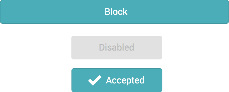
.button--disabled {
background: #eee;
color: #aaa;
&:hover {
cursor: no-drop;
}
&:hover, &:focus {
background: #eee;
color: #aaa;
}
}
.button--active {
&:before {
content: '';
@extend .icon-check;
vertical-align: middle;
margin: 0 5px;
}
}
An OOCSS Example: Buttons
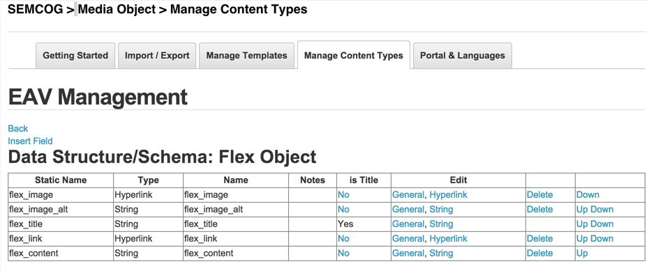
An OOCSS Example: Flex Media
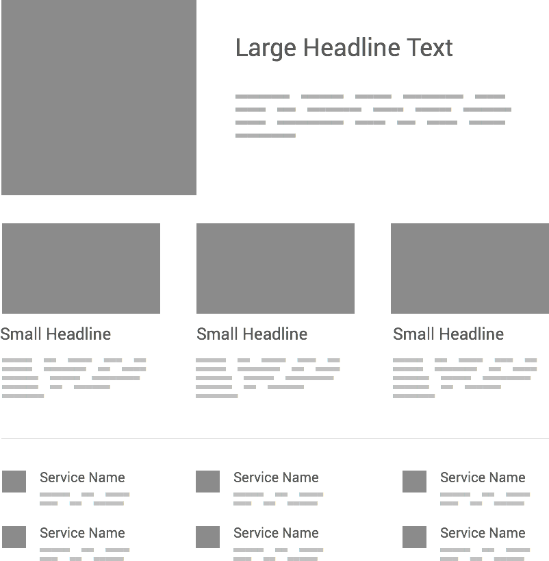
An OOCSS Example: Flex Media
An OOCSS Example: Flex Media
An OOCSS Example: Flex Media
An OOCSS Example: Flex Media

      Title Text

    Paragraph Text
An OOCSS Example: Flex Media
  @foreach(var e in List) {
	var Content = e.Content;


	      @Content.flex_title

	    @Html.Raw(@Content.flex_content)


  }
An OOCSS Example: Flex Media
.flex {
	display: flex;
	flex-direction: column;
	margin-bottom: 20px;
}

.flex__image {
	img {
		width: 100%;
	}
}
An OOCSS Example: Flex Media
.flex-list {
	display: flex;
	flex-direction: column;
	margin: 0 -20px;
	@include breakpoint($tablet) {
		flex-direction: row;
	}
	.flex {
		flex: 1;
		padding: 0 20px;
	}
}
An OOCSS Example: Flex Media
An OOCSS Example: Flex Media
An OOCSS Example: Flex Media
.flex--row {
  @include breakpoint($mobile) {
    flex-direction: row;
    .flex__content {
      padding-left: 20px;
    }
    .flex__image {
      max-width: 45%;
    }
  }
}
An OOCSS Example: Flex Media
An OOCSS Example: Flex Media
An OOCSS Example: Flex Media
.flex-list--bullets {
  @include breakpoint($tablet) {
    flex-wrap: wrap;
    .flex {
      flex: 1 0 (100%/3);
    }
  }
}
An OOCSS Example: Flex Media
.flex {
  display: flex;
  flex-direction: column;
  margin-bottom: 20px;
}

.flex__image {
  img {
    width: 100%;
  }
}

.flex--row {
  @include breakpoint($mobile) {
    flex-direction: row;
    .flex__content {
      padding-left: 20px;
    }
    .flex__image {
      max-width: 45%;
    }
  }
}

.flex-list {
  display: flex;
  flex-direction: column;
  @include breakpoint($tablet) {
    flex-direction: row;
  }
  margin: 0 -20px;
  .flex {
    flex: 1;
    padding: 0 20px;
  }
}

.flex-list--bullets {
  @include breakpoint($tablet) {
    flex-wrap: wrap;
    .flex {
      flex: 1 0 (100%/3);

    }
  }
}
https://github.com/hbuchel/2SXCFlex
A Note on CSS Modules
It's tempting to over-modularize.
Sass
Sass doesn't help us write better css, it helps us become more efficient at writing it.
Extend, variables, and mixins!
Variables
$dnn-red: #EF3E42;
Sass allows us to define variables that we can use throughout our stylesheet.
/* Variables */
$blue: #4778c6;
$gray: #eee;
$radius: 14px;
p {
  color: $blue;
  background: $gray;
  border-radius: $radius;
}
p {
  color: #4778c6;
  background: #eee;
  border-radius: 14px;
}
@extend
@extend manages our selector inheritance
Use when you want to share styles (smaller css objects) between your different modules.
.box-sizing, %box-sizing {
  -webkit-box-sizing: border-box;
  -moz-box-sizing: border-box;
  box-sizing: border-box;
}
.callout, %callout {
  font-size: 24px;
  line-height: 1.6;
}
.column {
  padding: 10px;
  background: $blue;
  @extend %box-sizing;
  @extend %callout;
}
.box-sizing, .column {
  -webkit-box-sizing: border-box;
  -moz-box-sizing: border-box;
  box-sizing: border-box;
}
.callout, .column {
  font-size: 24px;
  line-height: 1.6;
}
.column {
  padding: 10px;
  background: #4778c6;
}
@mixin
mixins allow us to repeat chunks of code.
We can also pass variables and settings to mixins to modify their output.
@mixin
@mixin image-replace {
  display: block;
  text-indent: 100%;
  overflow: hidden;
  white-space: nowrap;
}
.button {
  background: url(button.bg);
  @include image-replace;
}
.button {
  background: url(button.bg);
  display: block;
  text-indent: 100%;
  overflow: hidden;
  white-space: nowrap;
}
@mixin
Be careful.
Don't overuse mixins, consider if you can @extend an existing class. Mixins are especially handy within media queries or when you need to make a modification to a block of code.
@mixin
@mixin font-size($sizeValue: 1){
  font-size: ($sizeValue) + px;
  font-size: ($sizeValue / 10) + rem;
}
html {
  font-size: 62.5%;
}
body {
  @include font-size(16);
}
body {
  font-size: 16px;
  font-size: 1.6rem;
}
@mixin
@mixin breakpoint($break) {
  @media (min-width: $break) { @content; }
}
@include breakpoint($tablet) {
  .footer-connect {
    width: span(4);
  }
}
@mixin
@media (min-width: 920px) {
  .footer-connect {
    width: 40%;
  }
}
Thanks!


Codepen

Github
/hbuchel
Thanks to all of our generous sponsors!